Cinnamon Tower
TYPOLOGY: Residential
COUNTRY: Germany
CITY: Hamburg
YEAR: 2015
COMPETITION: 2006, 1st prize
GFA: 4.250 sqm
CLIENT: Gross & Partner
AWARDS: Deutscher Architektur Preis 2017 (commendation) for Harbour Masters Building Ensemble, BDA Hamburg Architecture Award 2016 (1st prize), German Facade Award for rear-ventilated facades 2015 (commendation)
NOMINATIONS: Mies van der Rohe Award 2017, Polis Award 2017 for Harbour Masters Building Ensemble
PHOTOS: © Christian Richters (tower) | Rainer Mader (pavilion)
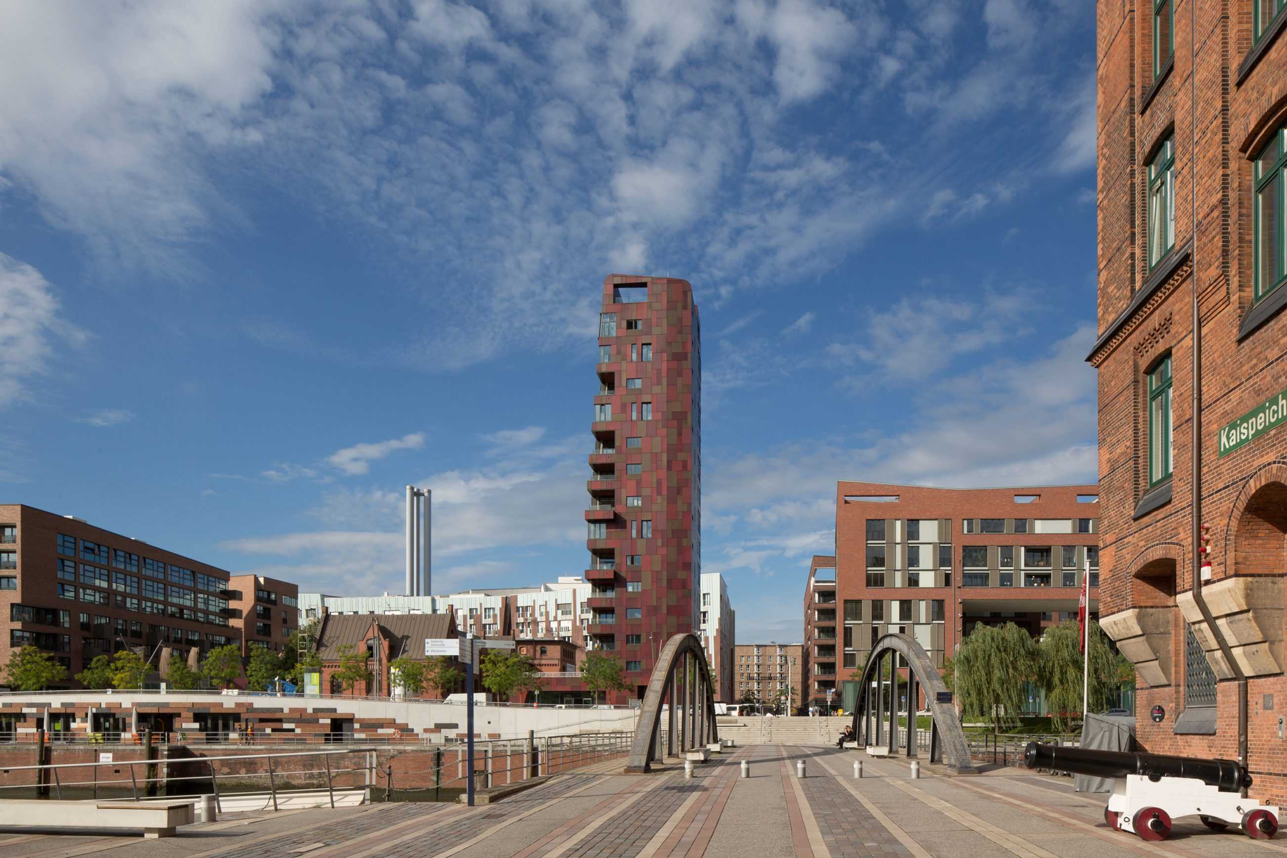
The Cinnamon tower was conceived as freestanding campanile – a pin on a piazza was the concept behind the premiated competition design by BOLLES+WILSON for the existing 19th century Harbour Masters Building.
A tower was not anticipated in the competition programme, but the jury agreed that a tower anchors the public functions around the only remaining historical building to survive between the megablocks of the ‘Overseas Quarter’ master plan. The historic building will also be more autonomous.
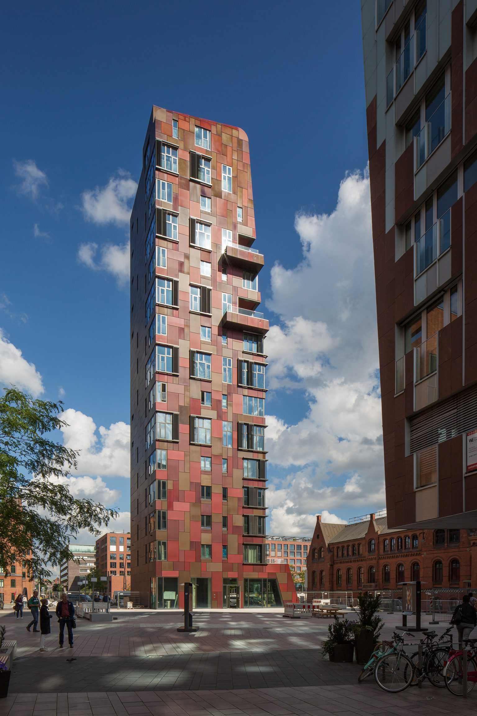
Slenderness is essential for a campanile. Over the course of its 8-year gestation this was respected – even while its function mutated from stacked restaurants to housing. The 13 x 16 m floor plan tapers towards the top. With a height of 56 meters the tower is 4-times higher than it is wide.
How can such a thin chap be efficient?
The efficient answer is duplex apartments. Originally the concept foresaw seven apartments, each on 2 floors, a panoramic living deck on the upper level and bedrooms with punched windows below. Precise market analysis led to a variation of this formula: one triplex apartment at the top and some 1-floor apartments at lower levels. Built were ten apartments, four with 130 sqm, five with 185 sqm and one with 300 sqm. The tower has a gross floor area of 4.300 sqm and a volume of 16.000 cubic metres. At the ground level, the piazza level is a commercial area of around 300 sqm.
Strict high-rise regulations demanded an escape route from every floor via secured escape stair. The possibility to clean every window from the inside was also a criterion to be met. The spectacular view of the New Elbphilharmonie should not be blurred by dirty windows. Room-high windows on three sides of the living room also allow the tracking of incoming cruise ships.
Facade panels of anodized aluminium sheets in different gradations of dark red correspond to the patchwork of BOLLES+WILSON’s pavilion from 2008. This was the first realized component of the Harbour Masters ensemble. In sunlight these aluminium panels take on colourful nuances while on cloudy days they assume a darker, more serious Paul-Klee like appearance. This is a building that changes its character according to the incidence of light, a new figure on Hamburg’s skyline.


Kita 102
TYPOLOGY: Educational
COUNTRY: Germany
CITY: Frankfurt
YEAR: 1992 / 2014
CLIENT: Stadt Frankfurt
AWARDS: German Architecture Award 1993, Commendation
PHOTOS: © Waltraud Krase (1992), Rainer Mader (2014)
The 1992 Kita 102 in Frankfurt – Griesheim was one of BOLLES+WILSON’s first buildings in Germany. 22 years later it has been extended. What does it mean to revisit an early work? To measure if it has stood the test of time? Or even if the architectural themes of that time are still pertinent today?
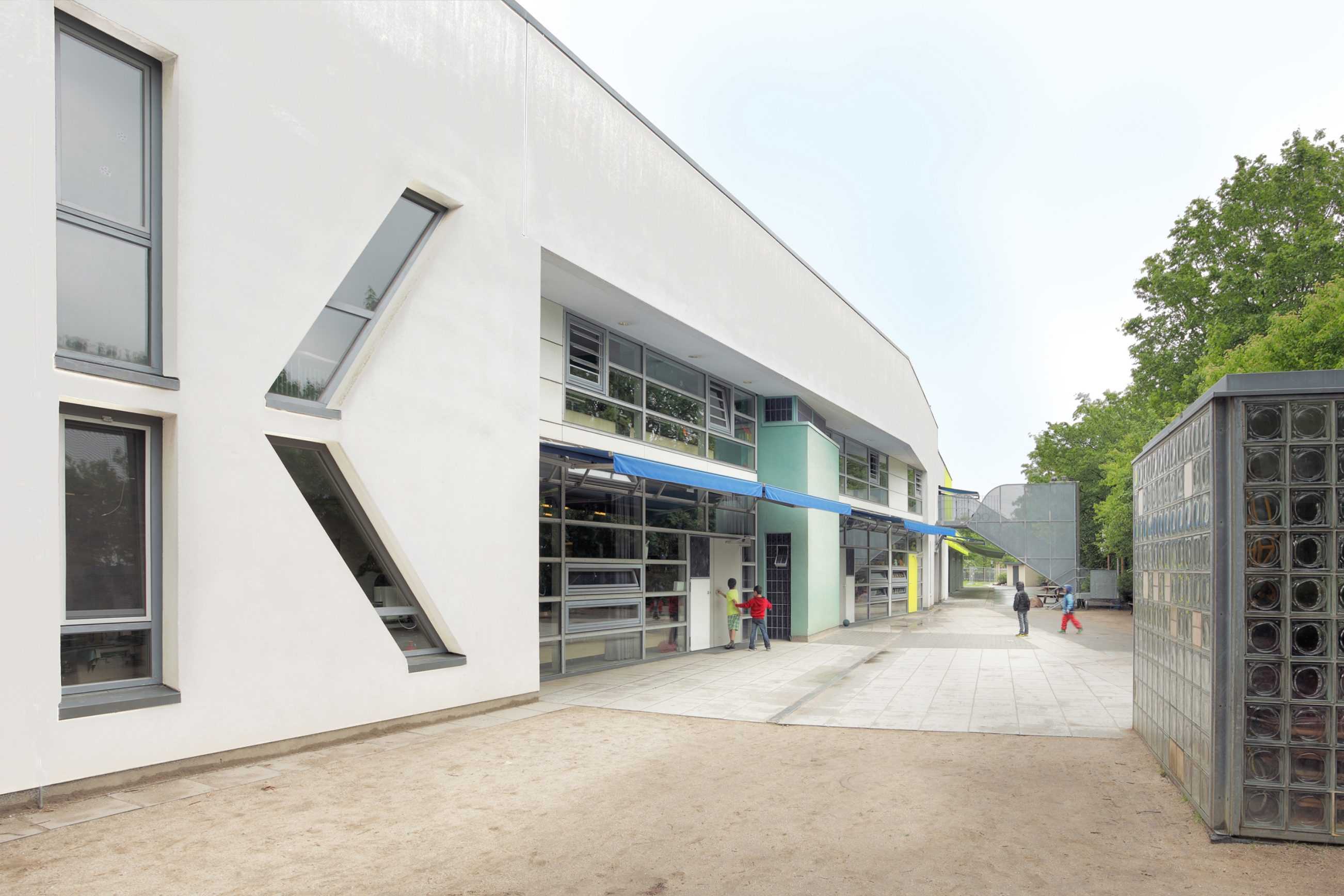
What is immediately obvious is that a generous two floor, curvaceous and somewhat expressive sculpted volume is no longer feasible under today’s stringent budget restrictions (the political promise to deliver a kindergarten place for every child). The new extension is single storey, docking on to and sloping down from, an original 7 m high sport and sleeping hall.
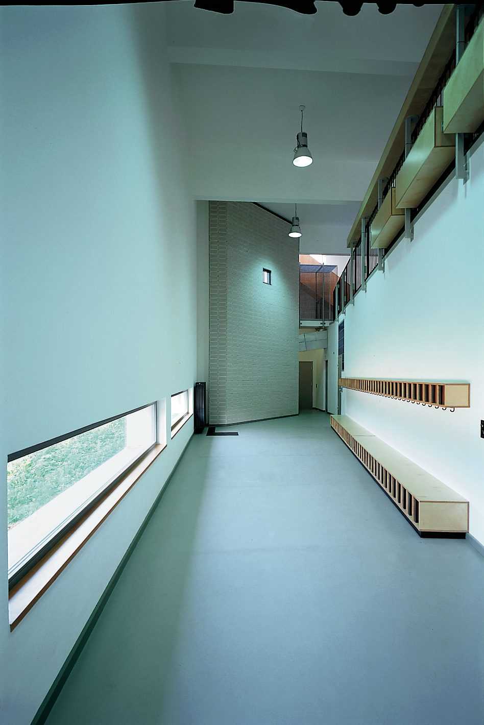
The 3 original ground floor classrooms were for conventional pre-school kindergarten use, and the upper 2 rooms after-school homework facilities for older kids. The 3 new ground level classrooms extend kindergarten functions, kids can run out directly from group to garden.
The original building expands in width and height, a conical volume explained at the time as a metaphor for growing – spaces expand and contract as kids run from one end to another. A narrative scenario that extended to details like 2.10m high doors for teachers beside 1.50 m doors only for kids. Draconian budgets preclude such whimsical game playing in the new extension, perhaps it is also no longer the time for architecture to reflect on its syntactical potential. In the original Kita four windows conspired to inscribe a giant letter K across the facade. A readable building for children who are learning to read. Today it is left to colour to signify. A thematized May-Green has been here co-opted (as in almost every second contemporary Kindergarten) to signal a fresh, playful optimism. It is the only internal colour. Also a green horizontal beam/gutter above a south facing glass facade benevolently grows extended sun-blinds (also May green) to wrap the sunny side in a Mediterranean-like slab of shade. Window articulation is no longer expressive, a tough neighbourhood requires defensive measures if night cooling is to be activated.
What was in 1993 described, as an east-west slab turning its back to the noise of a nearby autobahn is now a very long east west slab, still turning its back and opening southward to an extended linear play-ground.


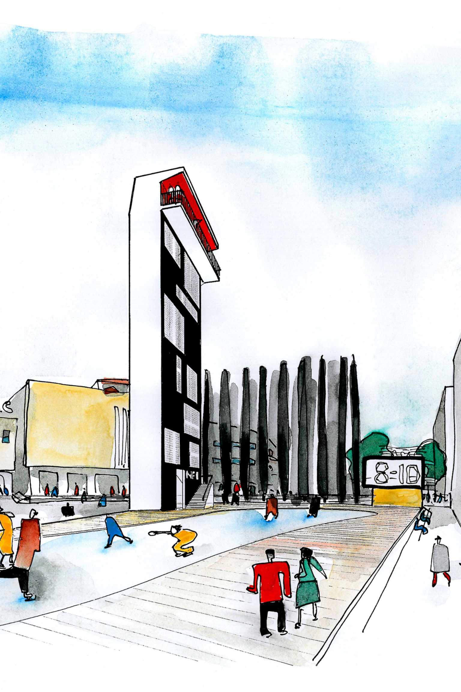
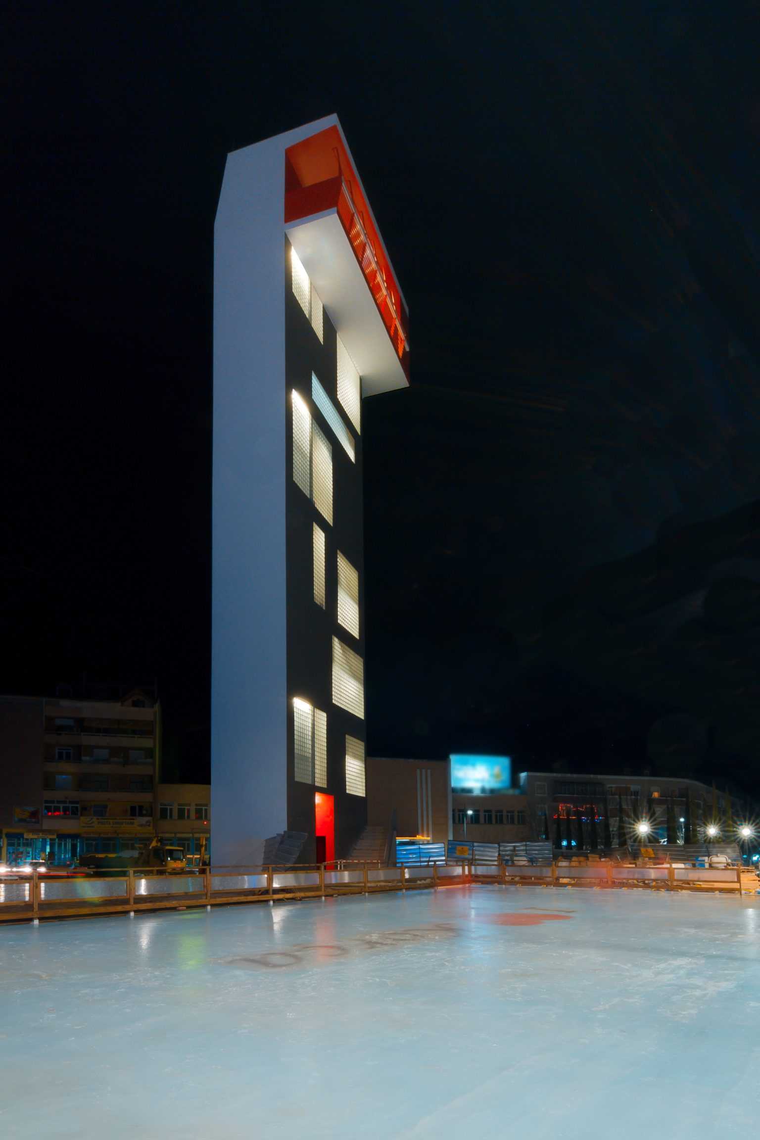
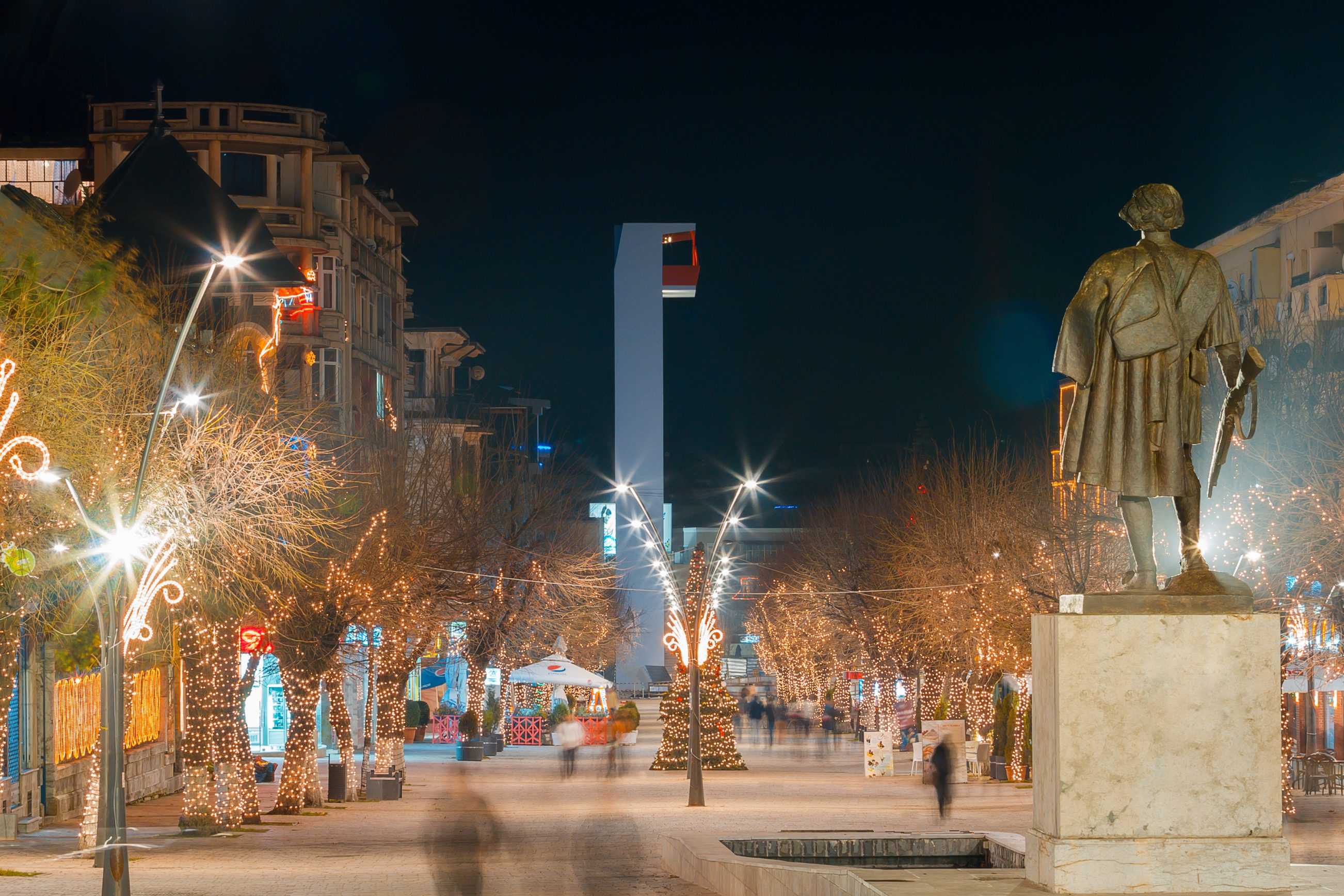
Red Bar in the Sky
TYPOLOGY: Public
COUNTRY: Albania
CITY: Korça
YEAR: 2014
CLIENT: Municipality of Korça
PHOTOS: © Andronira Burda, Daniel Dervishi, Nico Peleshi, Roman Mensing
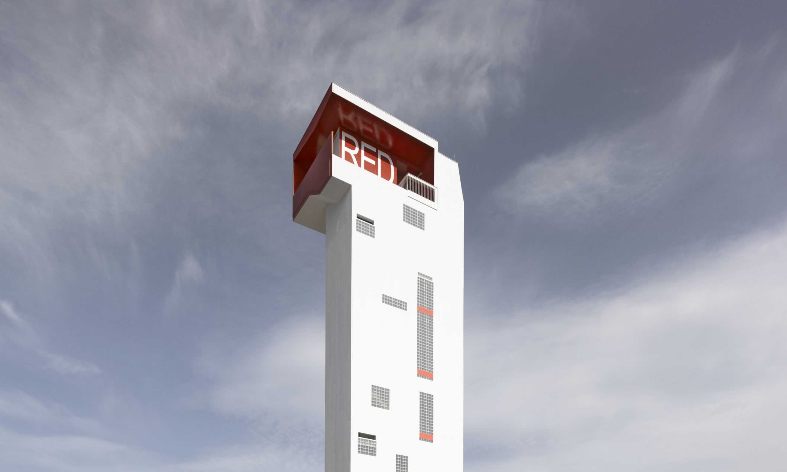
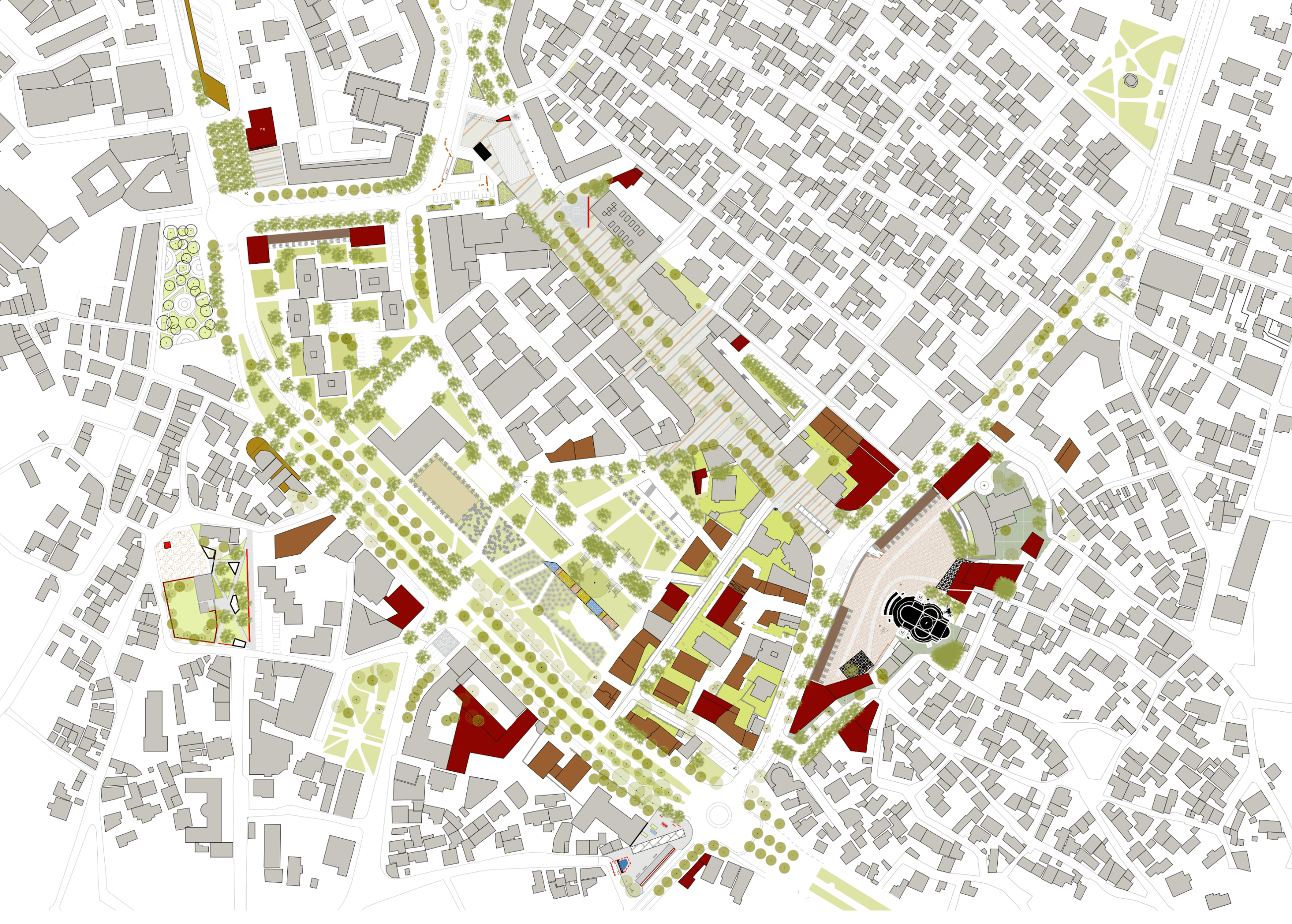
In time for Christmas 2014 the city of Korça in Albania realized BOLLES+WILSON’s design for a campanile – the Red Bar in the Sky. It focuses the Theatre Square, the concluding phase of the B+W 2009 masterplan (International Competition 1st prize). The campanile which functions as a lookout tower for Korcians to appreciate the delicate grain of their city is located at the end of the central pedestrian boulevard ‘Shën Gjergji’ (landscaping by B+W). Opened in winter the Red Bar in the Sky was accompanied by an ice skating rink installed by Greek skating specialists.
–
Related project:
Masterplan Korça City Centre, 2009, 1st prize


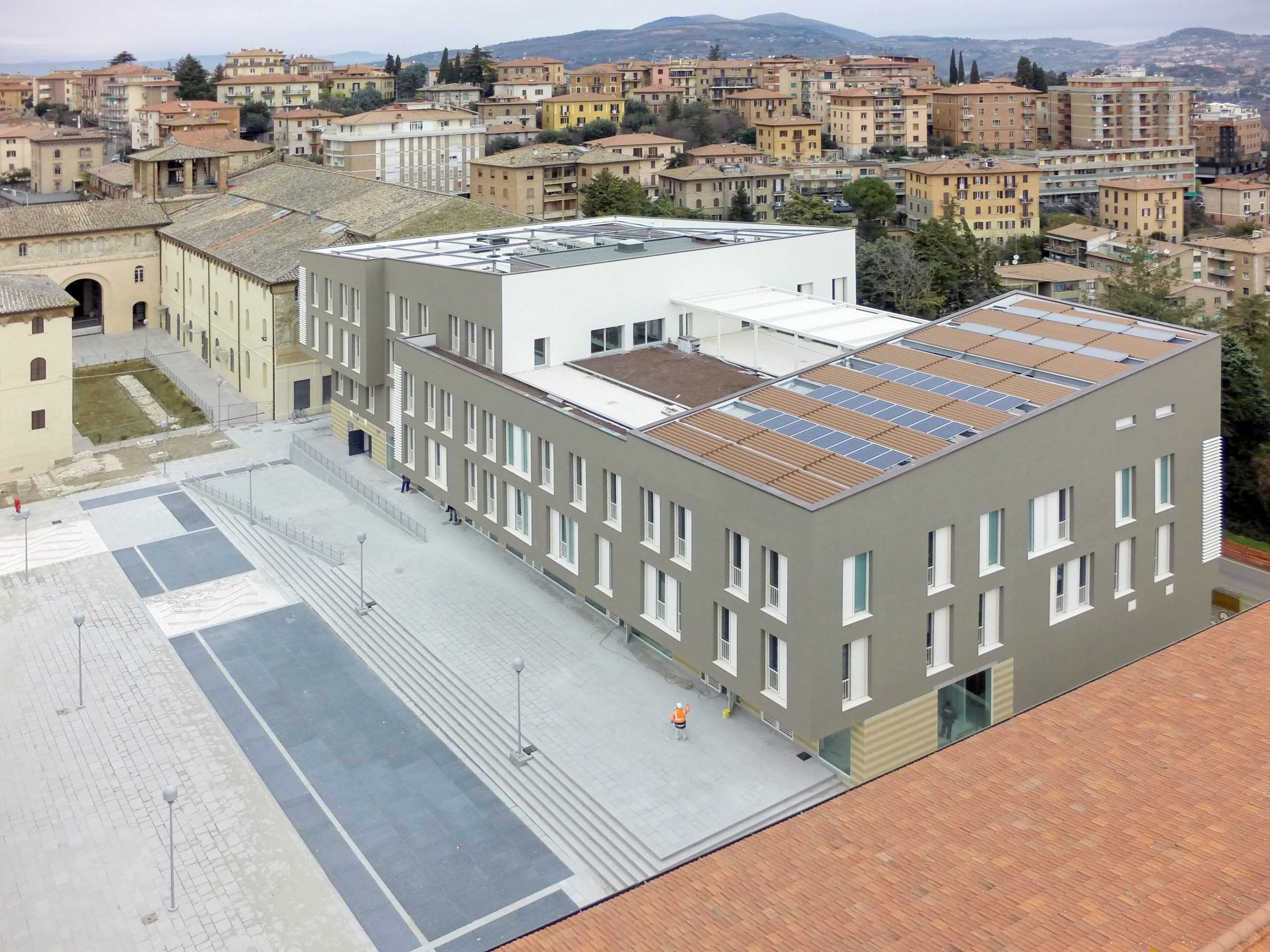
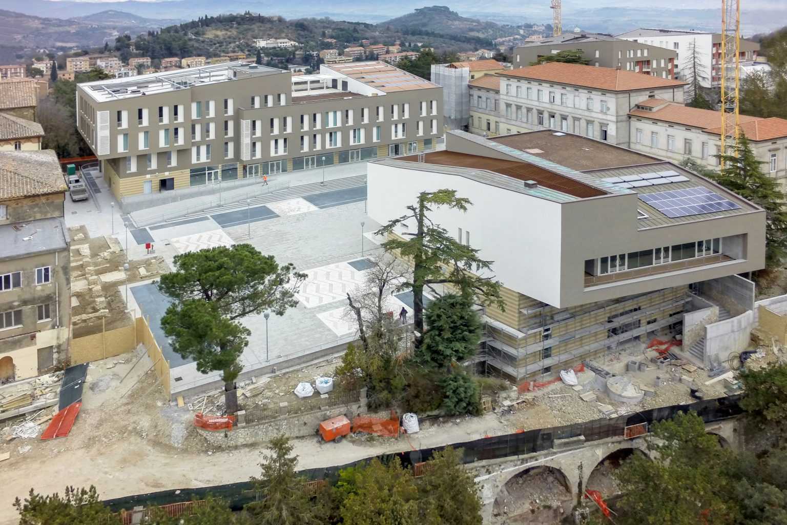
Monteluce Quarter
TYPOLOGY: Masterplan / Mixed Use / Landscaping
COUNTRY: Italy
CITY: Perugia
YEAR: 2006 – 2015
COMPETITION: Invited Competition 2006, First Prize
CLIENT: BNL Fondi imobiliari SGR p.A. / Fondo Umbria – Monteluce Unit / BNP Paribas REIM SGR p.A.
AWARDS: Premio Urbanistica 2007 (category Quality of Public Spaces), Italian National Institute of Urban Planning
CONSTRUCTION PHOTOSs: © BNP
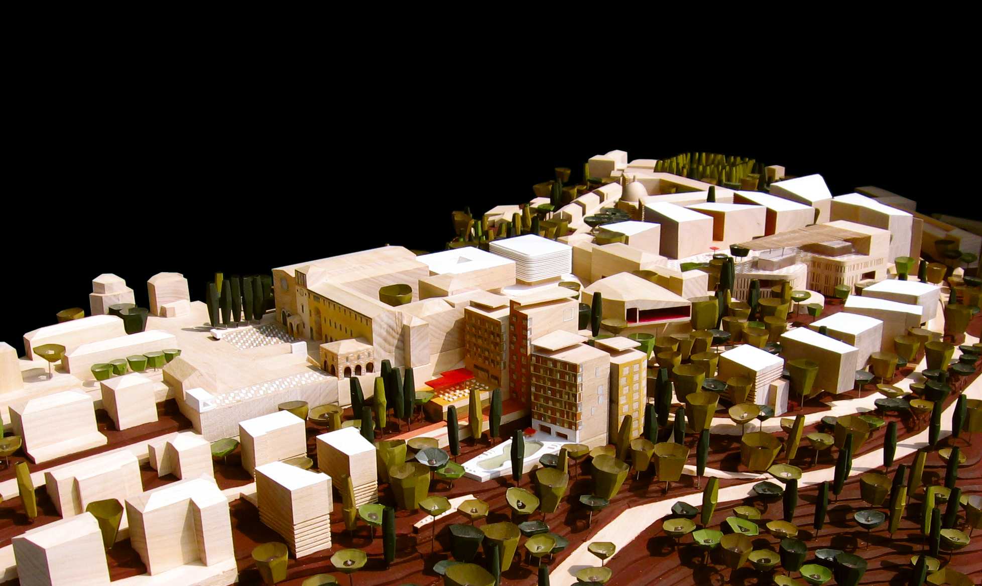
MONTELUCE MASTERPLAN
On 12th sept. 2006 the office of Bolles+Wilson was awarded the first prize in the International Design Competition for Monteluce in Perugia.
The jury lead by Axel Sowa, director of “Architecture d’ aujourd’hui” commended the winning entry for its respect and sensitivity to the scale of Monteluce, its morphological compatibility with the historic structure of Perugia and its sympathetic relationship to the surrounding Umbrian landscape.
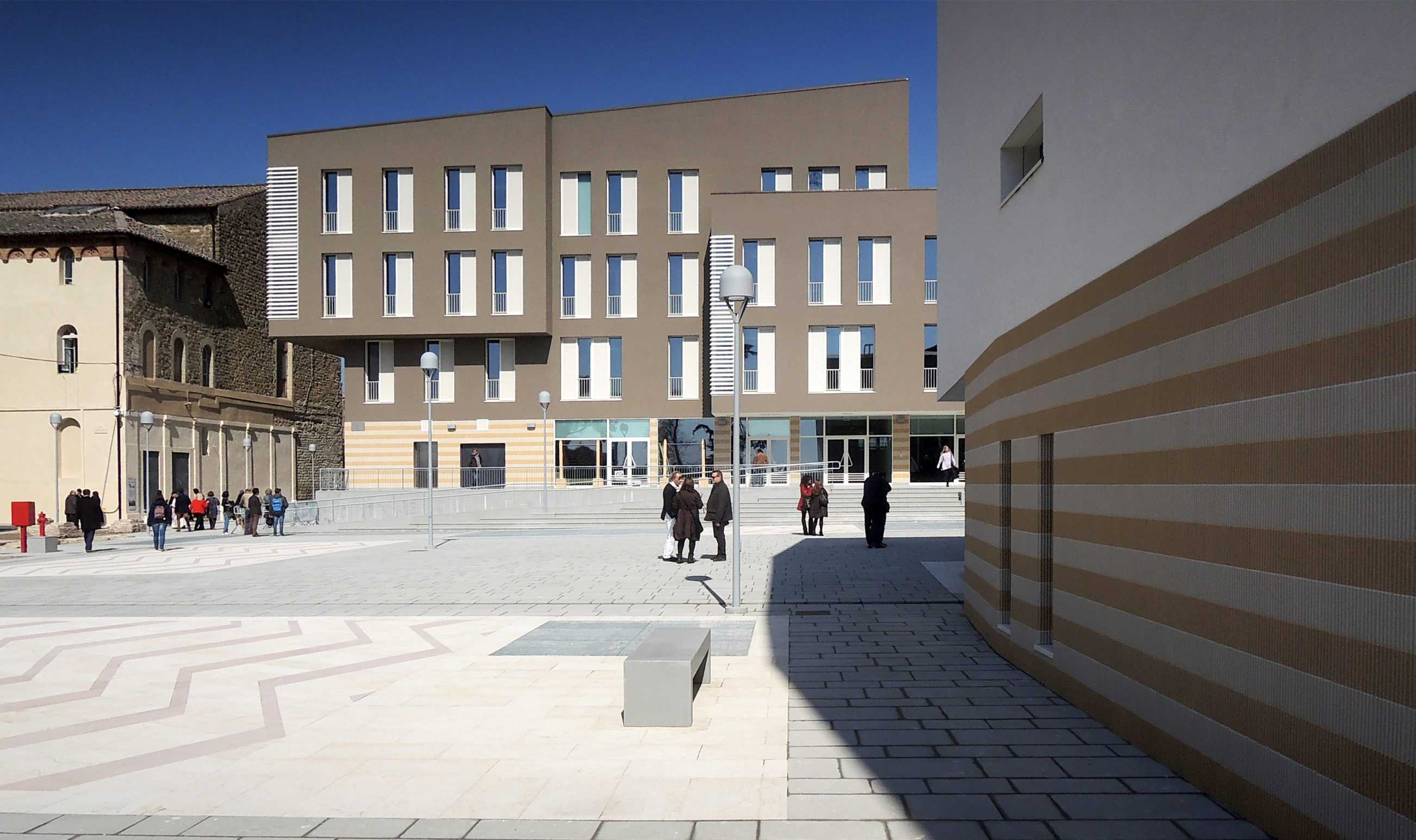
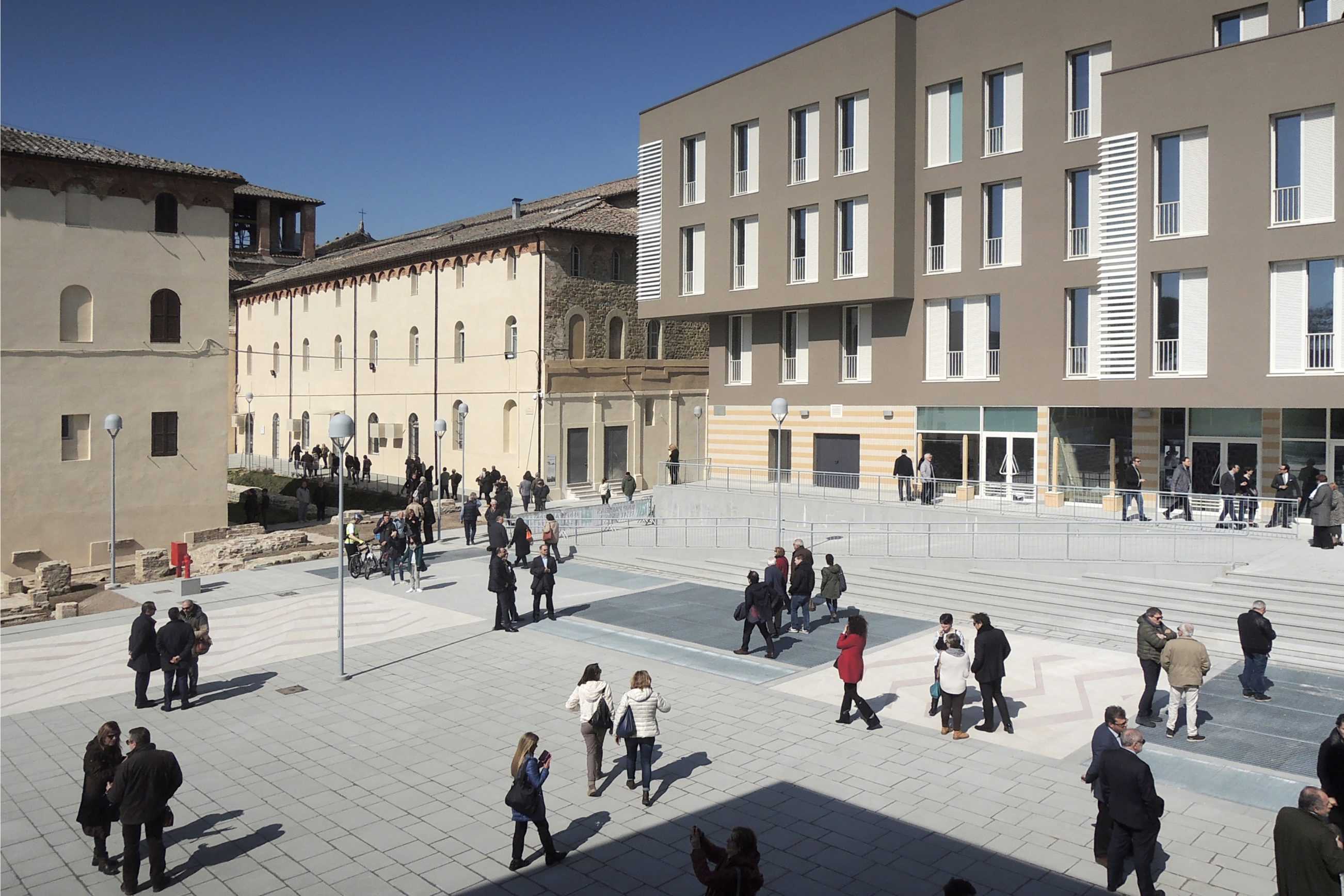
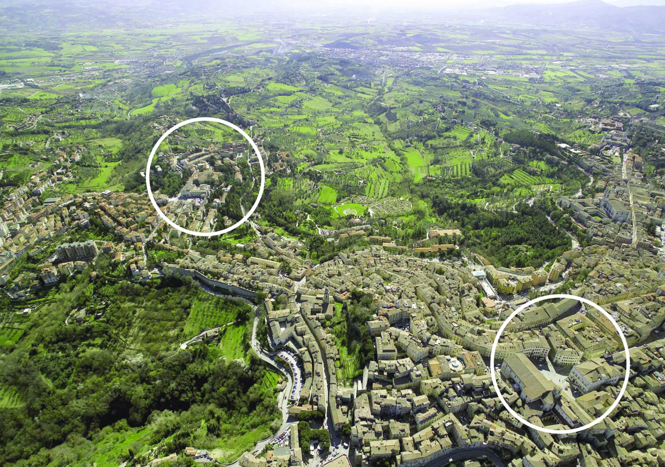
The Convento delle Clarisse of S. Maria di Monteluce originating in 1218 stands outside the Etruscan walls of Perugia, an outpost protecting one of the main access roads. Expansion outside the medieval walls reached Monteluce at the end of the nineteenth century. A concurrent appropriation of religious assets by the State instigated the opening of a gate to the Piazza Monteluce and between 1910 and 1923 the construction in the monastery garden of a series of hospital pavilions.
The Competition Program developed in close co-operation with the Commune di Perugia called for a total of 65,000 sqm – 43% of which is student and private housing and 25% subsidised housing. The new urban Quartier is networked in terms of a continuity of urban spaces and a rich programmatic mix including a maximum of 10% retail and 5% office use as well as hotel and conference facilities, local health offices, kindergarten and a new public park.
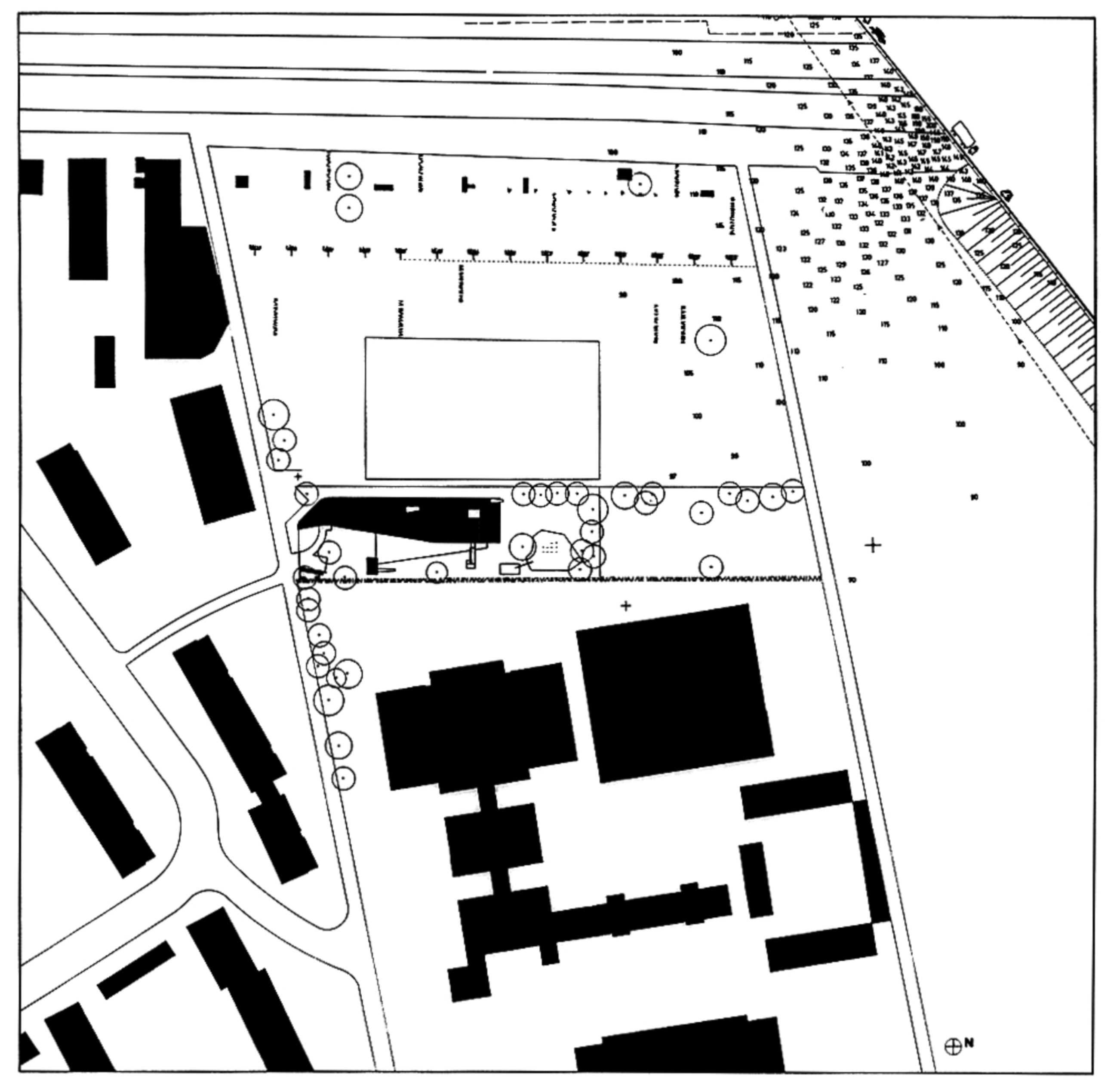
The Bolles+Wilson design developed and presented in 1:500 model format rejects authoritative geometry in favour of a sequencing of localised responses tailored to the dramatic topology and framed views out and across the luxurious Umbrian landscape. For economy and continuity many new structures occupy the footprint of redundant hospital buildings, a strategy that preserves the extensive terraced system of retaining walls and protected trees.
Bolles+Wilson describe their scheme as Urban Choreography, a sequence of public spaces unfolding from the S.Maria di Monteluce church in the west to the new Park d’Este. A first Piazza is framed by the Monestry portico and the one remaining Hospital Pavilion (Public Health Offices). To the north are offices and a submerged supermarket. To the south a Hotel and Conference Pavilion frame the view in the direction of Assisi. A second Conical Piazza is enclosed by a row of student housing buildings to the north and an opposing commercial/ restaurant Acropolis. Here deck- like upper terraces offer spectacular views of the historic skyline and Umbrian landscape.
MONTELUCE QUATTRO
The core of the new urban quarter became the (architectural) responsibility of BOLLES+WILSON (see siteplan). In realization it follows very closely the competition proposal of two Piazzas on the crest of the hill/ridge, underneath these two levels of carparking ensure car free public spaces (500 cars disappear underground). The strategic placement of these two Piazzas follows the typical Perugian trope of leaving one side of a space open for cooling winds and views out across the sensuous and gently rolling Umbrian landscape (views across the valley to Assisi).
The strategy of two piazzas introduces a spatial sequence resulting from the integration of the historic monastery and the12th century chapel – their arched entrance portal announces the entry to the first new Piazza, now named Piazza Cecilia Coppoli (1426-1500, poetess and humanist) and opened on 19th March 2015 by Catiusca Marini – President of the Region of Umbria. Signora Marini described the Monteluce spaces as ‘an investment in the culture of the city, also in the public patrimony of Perugia, an exemplary work and graceful urban transformation, one that experiments with a new contemporary urban architecture.’


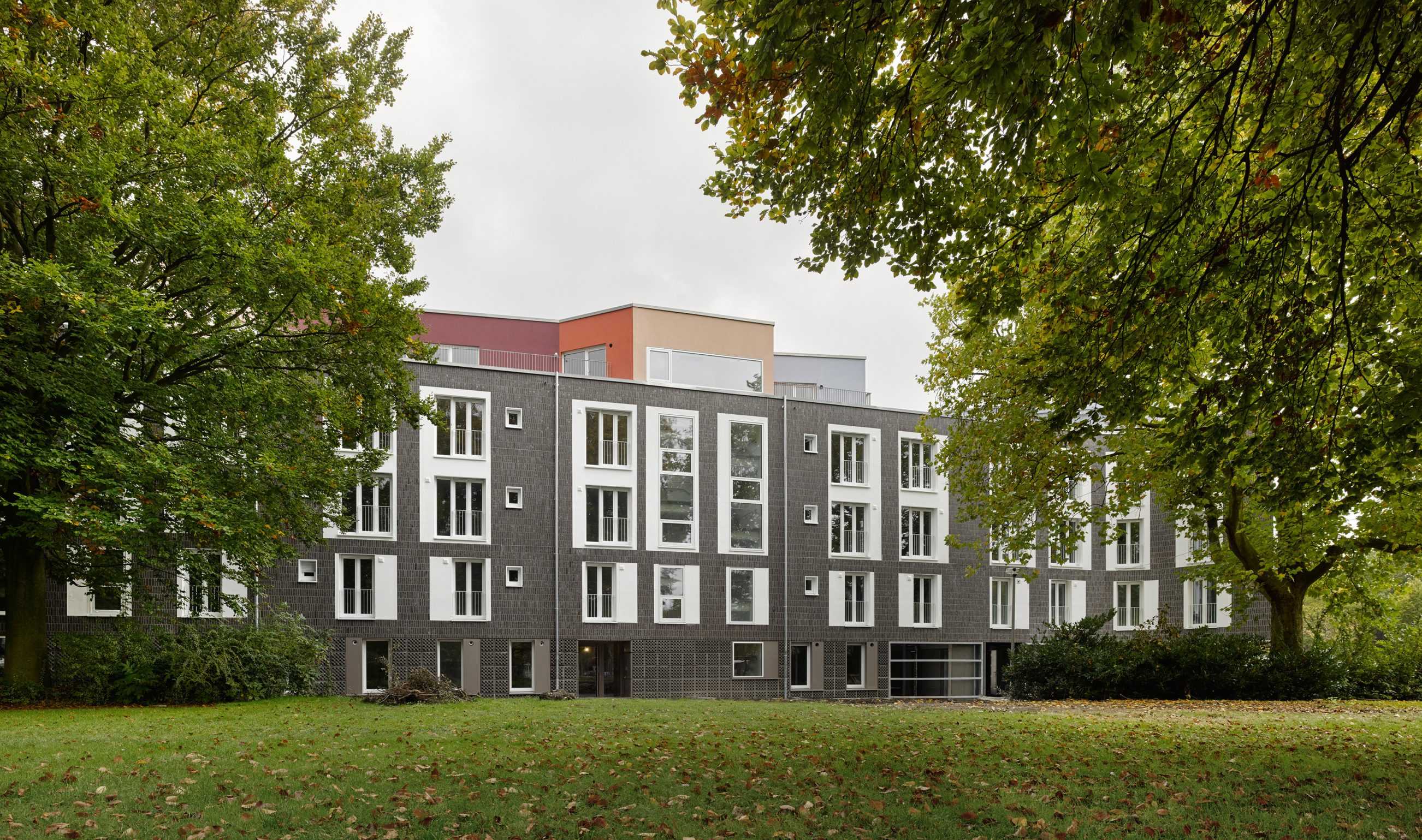
Housing at St. Sebastian
TYPOLOGY: Residential
COUNTRY: Germany
CITY: Münster
YEAR: 2016
COMPETITION: 2009, 1st prize
GFA: 8.180 sqm
CLIENT: Wohn + Stadtbau GmbH
AWARDS: “Exemplary publicly funded residential projects” – North Rhine-Westphalia Regional Prize for Architecture,
Housing and Urban Development 2017
BDA Münster-Münsterland award for best buildings 2017,
honorable mention
PHOTOS: © Roman Mensing, BOLLES+WILSON
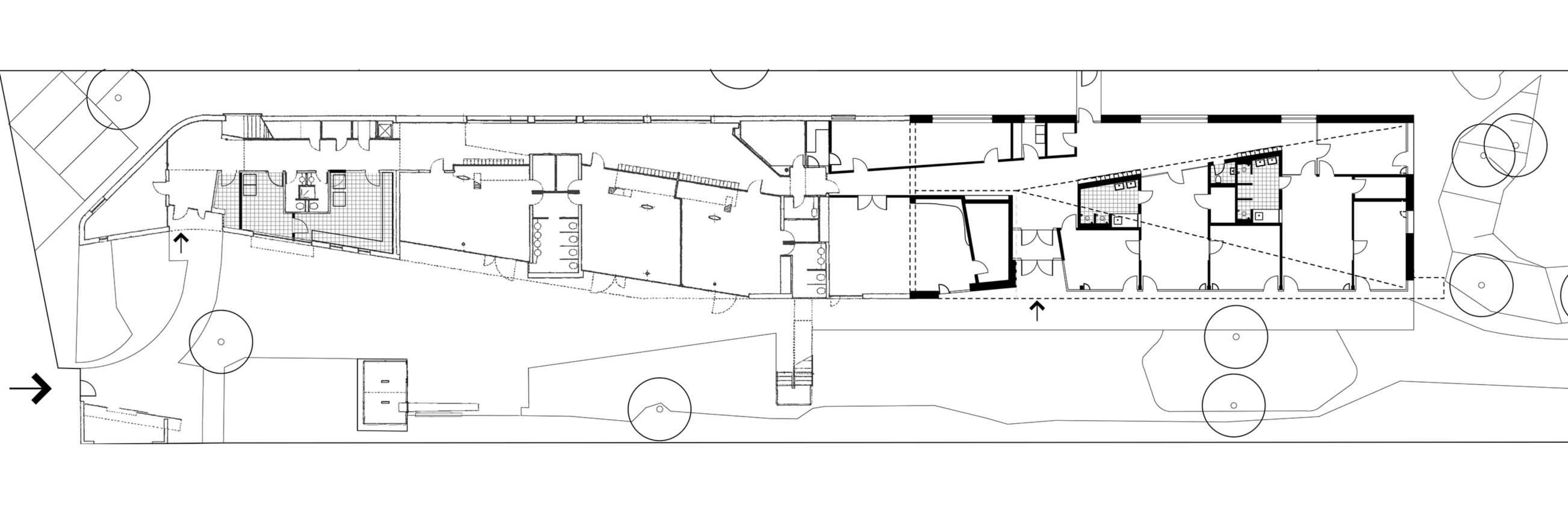
In 2009 BOLLES+WILSON won the 1st prize for housing and a kindergarten on the site of the 1960ies St Sebastian Church. It was expected that the emblematic oval form of the church be demolished. Instead the kindergarten colonized the nave. It was opened in 2013 – a much published reuse with interior green weather protected play decks.
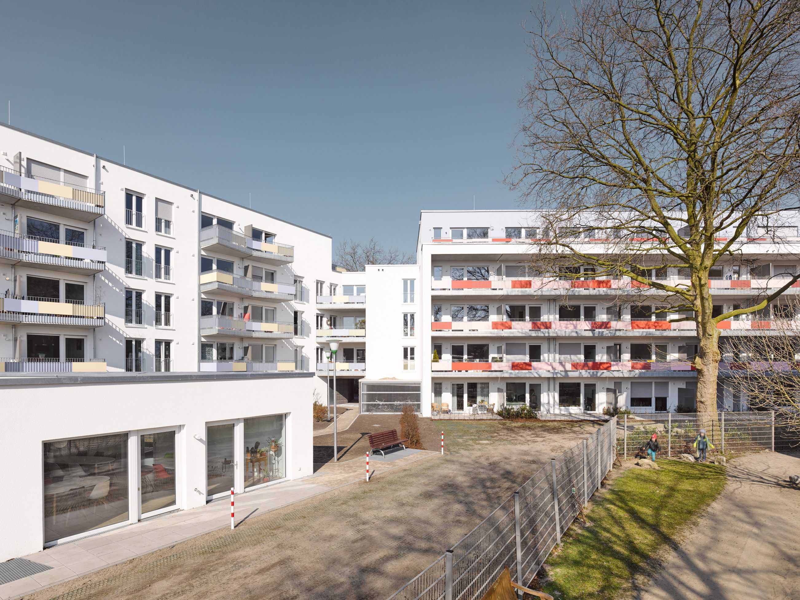
2015 phase 2 was complete, a peripheral frame of housing protecting the kindergarten from a noisy street and giving a precise edge to the adjacent park.
Market realities are clearly visible in the differentiation of the social (subsidized) housing with its bright white and pink plaster facade to Hammer Str. and the owner-occupied flats with their noble dark brick facade facing the mature trees in the park.
One corner tree is explicitly embraced by the projecting white sheet of the street facade.
Only kitchen and bathroom windows are allowed to receive traffic noise; living rooms and balconies turn inwards to the quiet green space surrounding the kindergarten.
Unexpected colour animates the lift and stair tower and the setback roof apartments. This polychrome trope also animates the skyline of the park elevation. Here big white frames give a grand order, a vertical hierarchy. But ultimately it is the grandeur of the existing trees that claim the status of leading actors in the spatial choreography.